Sunday, July 12, 2009

Style Element - Simple Example

Here is a simple example of using the Style element. Defining a style is similar to using a cascading style sheet to define styles. In WPF you can do much more with styles though. I am only going to show a simple example.

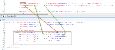
Look at the example below. The Border element has its style defined inline. I define a Style just for my Border elements based on its existing properties:
After your style is defined, you can now set it to your element:
<Border Style="{StaticResource TitleBorder}">

Wednesday, April 30, 2008

ToggleButton in a TreeViewItem - Customizing

TreeViews consist of a collection of TreeViewItem controls. TreeViewItems have an expander which is commonly seen "+" when the item can be expanded and a "-" when the TreeViewItem is exanded. Here's an example: Well, I'm not too crazy about how this looks...it just doesn't blend with the way my app looks. So I set about to customize it.

Turns out that expander is a ToggleButton. The ToggleButton has one default event "IsChecked=True". When IsChecked is true the default ToggleButton changes from a "+" to a "-". Easy enough. I changed the graphics of this to a simple triangle that points to the right by default and rotate it pointing downward when IsChecked is true. The result looks like this: Ok, this looks better to me. But I notice something funny. The click on the ToggleButton ONLY seems to register if I click on the graphic area of the button; meaning I have to click on the thin line of the triangle itself to expand it. I can't even click in the center for it to work! This resulted it having to try to click on the line multiple times for it to register the click and expand. This won't do.

The Fix
I filled in the triangle with a color to confirm that this is really the case. Sure enough, I can click on the filled-in center and it works. I don't like this solution though because I don't want to change my original design just to make it work. So I decide to enlarge the clickable area by wrapping the Path object (the triangle) in a Grid. I expand the grid so it's slightly larger than the triangle. This alone won't work. So I give the grid a background color and change the Opacity (the Alpha channel) of the color to zero. This works perfectly. Now I don't have to click right on the triangle but can click anywhere in the general area.

Saturday, April 26, 2008

Content Controls

Ever wonder why the TextBox has a Text property and a Label has a Content property? They both accept text that gets displayed on the window. So why doesn't Label just have a Text property?

TextBox Label
When you see a control that has a Content property that means that you can put another control inside that control. It is somewhat of a container but can only support ONE control. So you could do this:
<Label Height="Auto" VerticalAlignment="Top">
    <StackPanel>
        <Border BorderBrush="Black" CornerRadius="2,2,2,2">
            <TextBlock>Label with text and border</TextBlock>
        </Border>
    </StackPanel>
</Label>
But you can't do this:

Thursday, April 24, 2008

User Controls - Adding Design-Time Properties

When I say "Design-Time Property", I mean a property on the user control that shows up in your properties window and perhaps visually changes the user control when you change this property.

This property is actually a Dependency Property. Follow these steps to create a Dependency Property on the user control.

1. Declare a static DependencyProperty in the user control's xaml.cs class. The name of this DependencyProperty HAS to end in the word "Property".
public static DependencyProperty ConditionProperty;
2. Create a regular property with a get and set. This is usually the same name as your DependencyProperty but without the suffix "Property".
public enum ConditionEnum
{
    NonExistence,
    Danger,
    Emergency,
    Normal,
    Affluence,
    Power
}

public ConditionEnum Condition
{
    get { return (ConditionEnum)GetValue(ConditionProperty); }
    set { SetValue(ConditionProperty, value); }
}
(I'm using an enum as the type for this property.)
3. Create a static event you want to fire when your property changes.
private static void Condition_Changed(DependencyObject sender, DependencyPropertyChangedEventArgs e)
{
    ConditionEnum conditionValue = (ConditionEnum) e.NewValue;
    StatGraphControl thisUserControl = (StatGraphControl) sender;

    thisUserControl.BackgroundRectangle.Fill =
        new SolidColorBrush((Color) thisUserControl.FindResource(conditionValue.ToString()));
}
Notice how you get the value of what the property is being set to. You also have to get the user control itself from the sender parameter if you are going to change something on your user control. All properties and objects cannot be referenced directly from the same class because you are working with a static context. So you have to work on the properties and objects of the control passed in from the sender parameter.
In this case I am changing the background color of a rectangle in my usercontrol. I defined some color resources in the xaml that all have the same names as the names in my enum "ConditionEnum":
<UserControl.Resources>
    <Color x:Key="NonExistence">#FF808080</Color>
    <Color x:Key="Danger">#FFBE0000</Color>
    <Color x:Key="Emergency">#FFFF8D07</Color>
    <Color x:Key="Normal">#FFF0C908</Color>
    <Color x:Key="Affluence">#FF1AA451</Color>
    <Color x:Key="Power">#FF166C0D</Color>
</UserControl.Resources>
4. Create a static constructor to register your dependency property with your property and event. This last step kind of ties everything together.
   1:  static StatGraphControl()
   2:  {
   3:      ConditionProperty = DependencyProperty.Register(
   4:          "Condition",
   5:          typeof(ConditionEnum), 
   6:          typeof(StatGraphControl), 
   7:          new PropertyMetadata(
   8:              ConditionEnum.NonExistence, 
   9:              Condition_Changed));
  10:  }
Whoah, there's a lot happening here. Let's break it down:
Line 4 is the name of your property.
Line 5 is the type of your property.
Line 6 is the owner of the property.
Line 7 is going to create some metadata for your property. In this case it will set a default value (line 8) and what event is to be called when your property value changes (line 9).

Compile and now the property shows up (only in Expression Blend, not in VS 2008) in the properties window and when I change the property the color of the control now changes.
By default, the new property will fall under the Miscellaneous category. To change this, you want to add a Category attribute to your public property. There is also a Description attribute you can add if you think it will help.
[Category("MyApp")]
[Description("Setting the Condition will determine what color shows.")]
public ConditionEnum Condition
{
    get { return (ConditionEnum)GetValue(ConditionProperty); }
    set { SetValue(ConditionProperty, value); }
}

Sunday, April 13, 2008

Navigating Through Bound Data

About a month ago I had a requirement for a personal application I was building:
1. Show one piece of data through a label.
2. Have a Next and Previous button.

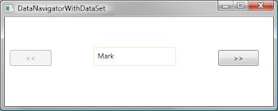
Like this:
Pretty simple window. Very hard to figure out. It took A LOT of study. Frankly I was surprised I couldn't find a clean cut answer anywhere for how to do this...hence, the following post.

The basic steps:
1. Add a class variable to store the CollectionView (tracks current record being displayed).
2. Set this.DataContext to your data source.
3. Set the variable you created in step one to (CollectionView)
CollectionViewSource.GetDefaultView(DataContext)

4. Add event handling for your variable's CollectionView.CurrentChanged event.
Here's the XAML:
   1:  <Window x:Class="DataBindingExample.DataNavigatorWithDataSet"
   2:      xmlns="http://schemas.microsoft.com/winfx/2006/xaml/presentation"
   3:      xmlns:x="http://schemas.microsoft.com/winfx/2006/xaml"
   4:      Title="DataNavigatorWithDataSet" Height="190" Width="460">
   5:      <Grid>
   6:          <Button HorizontalAlignment="Right" Margin="0,55,24,67" Width="67" Content="&gt;&gt;" x:Name="btnNext" Click="btnNext_Click" />
   7:          <Button HorizontalAlignment="Left" Margin="8,55,0,67" Width="69" Content="&lt;&lt;" x:Name="btnPrevious" Click="btnPrevious_Click" />
   8:          <Label Content="{Binding Path=FirstName}" Margin="147.407,50,160.747,67" Name="label1" BorderBrush="Bisque" BorderThickness="1"></Label>
   9:      </Grid>
  10:  </Window>
Here's the code behind:
   1:  using System.Windows;
   2:  using System.Windows.Data;
   3:   
   4:  namespace DataBindingExample
   5:  {
   6:      public partial class DataNavigatorWithDataSet : Window
   7:      {
   8:          private CollectionView view;
   9:   
  10:          public DataNavigatorWithDataSet()
  11:          {
  12:              InitializeComponent();
  13:              PopulatePeople();
  14:          }
  15:   
  16:          private void PopulatePeople()
  17:          {
  18:              Data data = new Data();
  19:              DataContext = data.GetPeopleDataSet().PersonDataTable;
  20:              view = (CollectionView)CollectionViewSource.GetDefaultView(DataContext);
  21:   
  22:              view.CurrentChanged += delegate
  23:                                         {
  24:                                             btnPrevious.IsEnabled = (view.CurrentPosition > 0);
  25:                                             btnNext.IsEnabled = (view.CurrentPosition < view.Count - 1);
  26:                                         };
  27:          }
  28:   
  29:          private void btnNext_Click(object sender, RoutedEventArgs e)
  30:          {
  31:              view.MoveCurrentToNext();
  32:          }
  33:   
  34:          private void btnPrevious_Click(object sender, RoutedEventArgs e)
  35:          {
  36:              view.MoveCurrentToPrevious();
  37:          }
  38:      }
  39:  }

Wednesday, April 9, 2008

Collection Binding

Say you want to bind 5 data items (maybe like rows in a DataView or items in a list) to a control. Only WPF Elements that are derived from ItemsControl can show the entire list of these items.

Take a look at all the WPF elements that inherit the ItemsControl (Derived Types folder).

So what kinds of data can be bound to these controls? Anything that supports the IEnumerable interface. This would be like arrays, lists, collections. You cannot bind a DataTable (does not implement IEnumerable) to these controls but you could bind a DataView (implements IEnumerable).

Tuesday, April 8, 2008

Binding to Data Objects (classes)

We did Element to Element data binding in the previous post. So instead of:
<TextBlock FontSize="{Binding ElementName=sliderFontSize, Path=Value}" />
You will change "ElementName" to one of the following:

Source - The object supplying the data.
RelativeSource - Allows binding to another object relative to the element you are on. It could be Self, a parent, a descendant or a previous item in a list.
DataContext - When Source and RelativeSource are not specified, WPF searches up the tree to find if the DataContext property is set on any elements. DataContext holds the Source for all elements inside it.

How to bind a data object (class that holds your data - usually just one row) to a window:
1. Create a class that has public properties on it.
2. Add bindings to the elements that will be displaying your data.
3. Set the DataContext of the container that will be displaying your data.

Example:
1. Create the Data Object
public class Person 
{
     public string FirstName { get; set; }
     public string LastName { get; set; } 
} 
2. Create your Bindings
<Grid Name="gridPerson">
     <TextBox Text="{Binding Path=FirstName}" />
     <TextBox Text="{Binding Path=LastName}" /> 
</Grid>
Note: The field name used for Path is CASE SENSITIVE. Your application will not generate a build error either. If your data is not showing up, check the case of the field name.

3. Set the DataContext (in this case, it is set in your code)
gridPerson.DataContext = App.Database.GetPerson();
Note:
DataContext = App.Database.GetPerson();
is valid also. Using gridPerson.DataContext just narrows the scope and makes the data only available to elements within gridPerson.

Element to Element Data Binding

<Slider Name="sliderFontSize" Minimum="1" Maximum="40" Value="10" TickFrequency="1" TickPlacement="TopLeft" />
<TextBlock Name="lblSampleText" Text="Simple Text" FontSize="{Binding Source=sliderFontSize, Path=Value}" />
The TextBlock's FontSize will change to the slider control's value. This binding in the xaml is saying, "Create a binding to the sliderFontSize.Value property."
Here's how you would create the equivalent binding in C#:
Binding binding = new Binding();
binding.Source = sliderFontSize;
binding.Path = new PropertyPath("Value");
lblSampleText.SetBinding(TextBlock.FontSizeProperty, binding);
More Info: Data Binding